Thursday, January 2, 2014

Questionable 3D - Person with a Scissor Blade Sculpture

      My project is an androgynous person hunched over a single scissor blade. I find it questionable because there is no explanation to why they are hunched over, and why do they only have a giant half of a scissor? I used a clay medium, in order to sculpt the person realistically. I believe I organized the anatomy very well.
I used the exact proportion of the human body, yet scaled down. I scaled up the scissor blade into a big enough blade for the person to lean on.
       This picture is of me sculpting the beginning stages of the body. In the beginning, I was not very sure what I was going to do. I planned on doing a fight scene between two females, however I decided against this and moved onto the person leaned over a blade. In brainstorming stages, I wanted to make a life size neanderthal, made of wire and plaster strips. This project would've taken a very long time and was better suited for a team of people. I decided against it. I am very pleased with the finished product of my sculpture. I am not sure if I plan to paint it, or leave it completed white. 
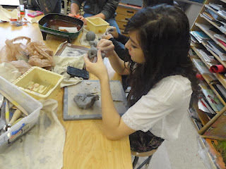
Plaster Portrait Project: Che Guevara

          For this project, I chose to form a plaster portrait of Che Guevara, the former Argentinian-Marxist revolutionary. I worked with Noah and we slathered plaster on a wooden board in order to layer on his cheekbones, nose, chin, and higher areas of his face. We brainstormed many different pop culture figures that would stand out and make a recognizable figure in the plaster.
         Although me and Noah were both thinking about keeping the plaster purely white, Mr. Sands advised us to add color to the plaster. You can see us testing colors out on slabs of wet plaster on cardboard in the first picture. We used acrylic paint to color at first, but it ended up making the plaster brittle and easily cracked. Instead, we used food coloring and made it mono-chromatic with only red, black, and white. This was a risk that ended up making the project more interesting.

 The finished product was very low-depth and shallow but I ended up liking it. The stencil-look and shadows looked just how I imagined and the red background was interesting. I ended up liking plaster a lot.

Tuesday, November 12, 2013

Sticky Situation - Girls At A Dinner Table


       I had big ideas for this piece and I wish I carried them all out successfully, but I saw these girls while I was eating dinner and decided it was a good use of repetition. They were all on their phones and disregarding the fact that a Kabuki dinner performance was going on infront of them. I think this was a good, spontaneous use of inspiration.
       I incorporated repetition with the use of five girls who were all on their phone at the same time. Also, my hand with a flip phone in it breaks the rhythm but in a way so that it brings more attention to the repetition in a more abstract sense.
      Acrylic was more choice of medium, because this piece had many layers. I had to lay down a table cloth, and a hand on top of it, including the girls all sitting at the table. The mini lessons also helped to teach me how to use this medium most effectively. I liked working with the paint knife.
      In the end, I didn't completely finish working on this piece but I definitely will come back to it and fill in more value, not to mention all the other details I have missed including plates, a flower vase, and more emphasis on the girl's phones.

Thursday, October 3, 2013

Up Close & Personal


       I went from approaching this prompt at a more abstract angle, but I ended up taking the prompt literally and used a 'personal' and 'up-close' photo of myself, which I proceeded to create through watercolor and colored pencil on watercolor paper. This specific picture of me also represented emphasis very well, because all the other colors except for the bandana were muted.
    
      The process of painting this was very frustrating for me because it seemed like I couldn't get it right. I am pleased with the results, however I feel like I should've done better during the drawing stage. One thing that helped me a lot was the opinions of others. I tried to look at it through a mirror by suggestion of Mr. Sands, and it helped me to "look at it for the first time" and realize that I should have fixed it a lot more during the sketching process.

       I almost decided to use all watercolor instead of any colored pencil, but I quickly realized that colored pencil gave a lot more depth and made the painting look more "edgy" than it did prior to application of the colored pencil. I am a lot more pleased with the painting now that I worked on it and put as much as I could into it. I would have been very upset with it if I left it without the shading that it really desperately needed.


Finished product and pumpkin

In progress.

Tuesday, September 10, 2013

What's The Point?

On my What's The Point project, I used a lot of contrast to draw attention to the puppy who sat on the right off-center of the paper. The fence was all white, except for shading to add dimension to it; therefore, I made the puppy all black to contrast against the white fence and his white bib.

 I tried to add plenty of value to make the fur pop out and add dimension. For this, I chose pen, because I don't think charcoal would have worked well to make the fur look the way that I wanted it. Also, pen is my preferred medium due to the fact that I don't like to blend as much as other forms of shading. I used a lot of crosshatching and hatching/parallel lines in order to add dimension and shading to this picture.

I was a bit scared to make the dog black, because I've never colored in fur the whole way before. I took the risk and colored the dog all black and I like the way it turned out because it adds a lot more substance to the picture. All in all, I thought that the picture might not turn out the way I wanted it to, but I pulled it off in a way that I am pleased with.
In the  process of drawing line art.